Frictionless Entry
Technical details
Client
Quidco
Team
1 Product Designer, 1 Product Owner, 1 SecOps, 2 Developers
Duration
4 Weeks
Year
2023
Category
Web
Skills
Data Analysis
Wireframing
User Interface
Interaction Design
Competitor Analysis
Design System
Tools

Figma

Miro

Jira
Project overview
During the Contentful migration, we viewed it as an opportunity to overhaul our homepage and apply insights gained from the 'Improve Shop Conversion' project to address user pain points. One of the problems was the current sign-up and sign-in process for Quidco users:
Users keep manually entering their email and password - time consuming.
Auto-fill for passwords often leads to users needing to request new passwords.
Accounts being locked out due to multiple failed password attempts.
Risk of multiple accounts being created due to the absence of account verification mechanisms.
In this project, my role was to revamp the homepage to incorporate the latest brand changes. I also had to redesign the form fields to enhance accessibility, improve visual hierarchy, and implement user-friendly interactions. I approached this project with a holistic perspective, aiming to deliver an exceptional user experience with a strong focus on user-centric design principles.
The steps I took
Summary
01.
Research
Used existing research and insights to inform my design decisions.
02.
Competitor Analysis
To identify current trends and best practices in the industry.
03.
Ideation
Encourages creativity, explores innovation, and facilitates problem-solving.
04.
Form Field Insights
A seemingly simple component that turned out to have many parameters.
05.
Email Verification
Add extra layer of security due to number of fake email addresses in the database.
06.
Outcome
Outcome of this project, identify lessons learned, and areas for improvement.
Insights gathering and exploration
Discovery
01.
Research
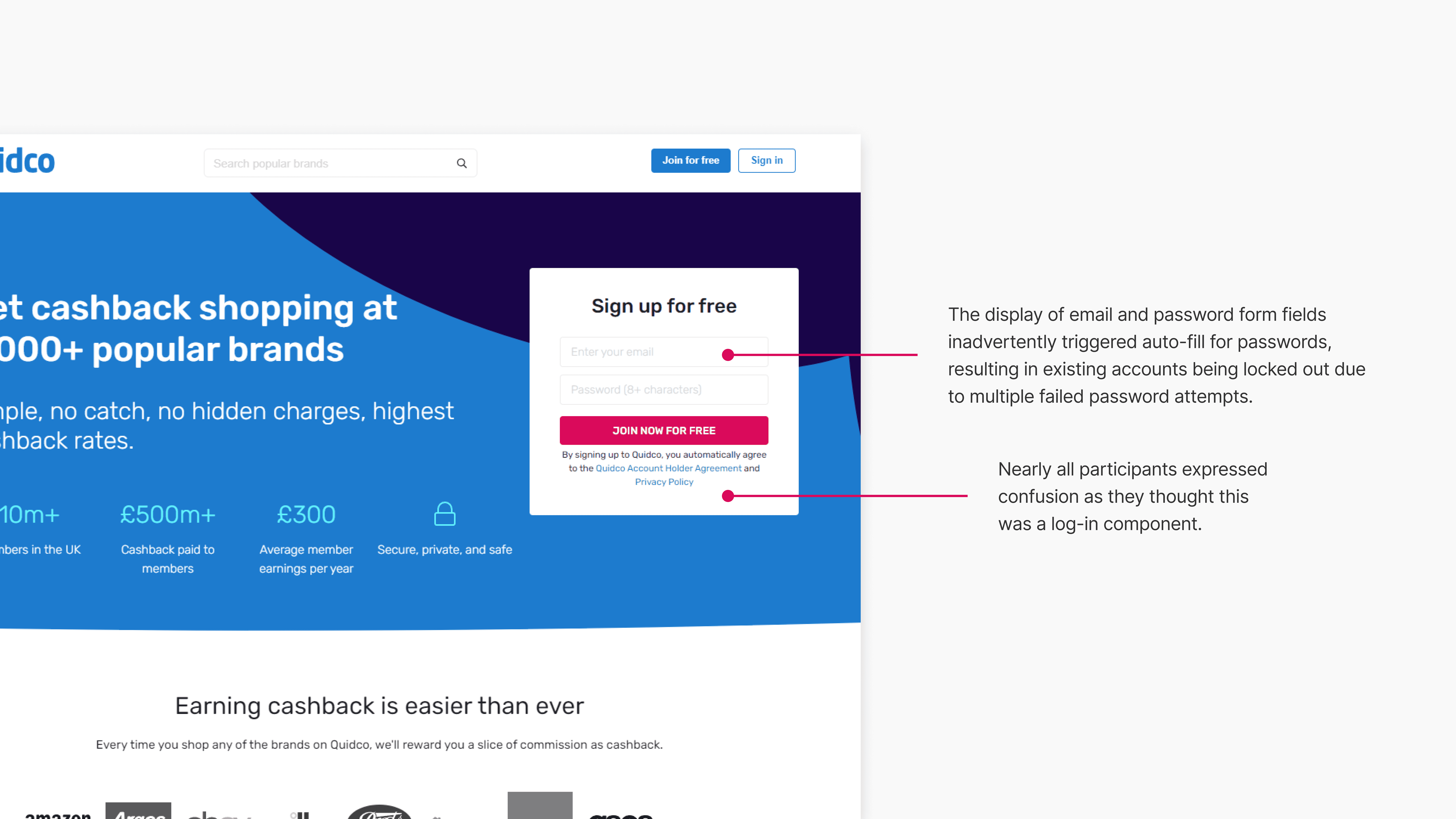
Utilising existing research and insights not only saved considerable time and resources by eliminating the need for redundant studies or data gathering, but it also streamlined my design decision-making process. With an in-depth understanding of user needs, recurring behavioral patterns, and pain points, my design requirements were clear. A recurring theme became evident during the study: nearly all participants expressed confusion when they initially attempted to sign-in directly from the homepage. After a few attempts, they eventually realised that the 'sign-in' form was intended for creating an account.
02.
Competitor Analysis
Through competitor analysis, I identified common trends and observed how users engage with our competitors. This deep dive provided valuable insights into feature preferences and effective design interactions, such as inline validation, that would enhance the user experience.
Brainstorming, wireframes and designs
Design
03.
Ideation
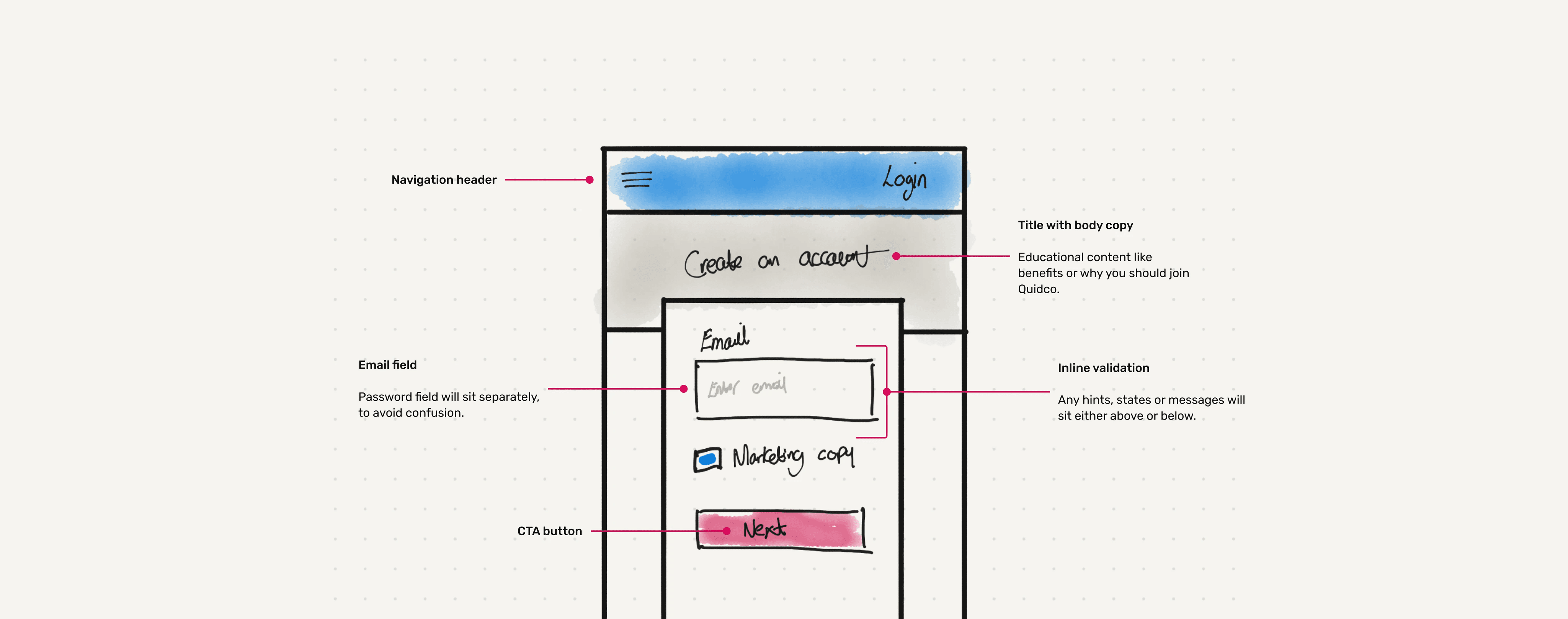
By utilising all of the previous insights and data, I was able to sketch and explore various ideas, prioritising solutions that addressed user pain points while considering their emotional experience.
04.
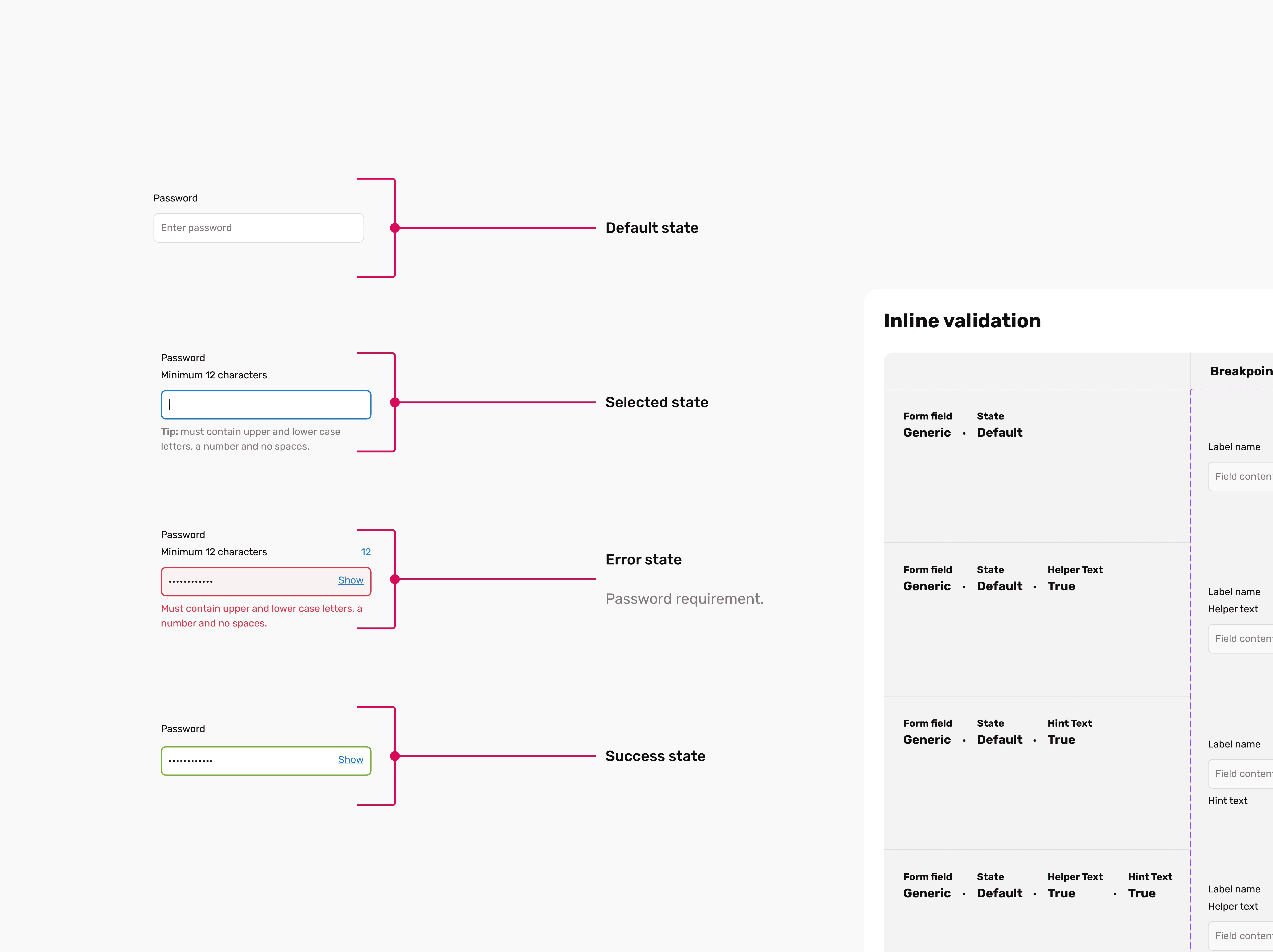
Form Field Insights
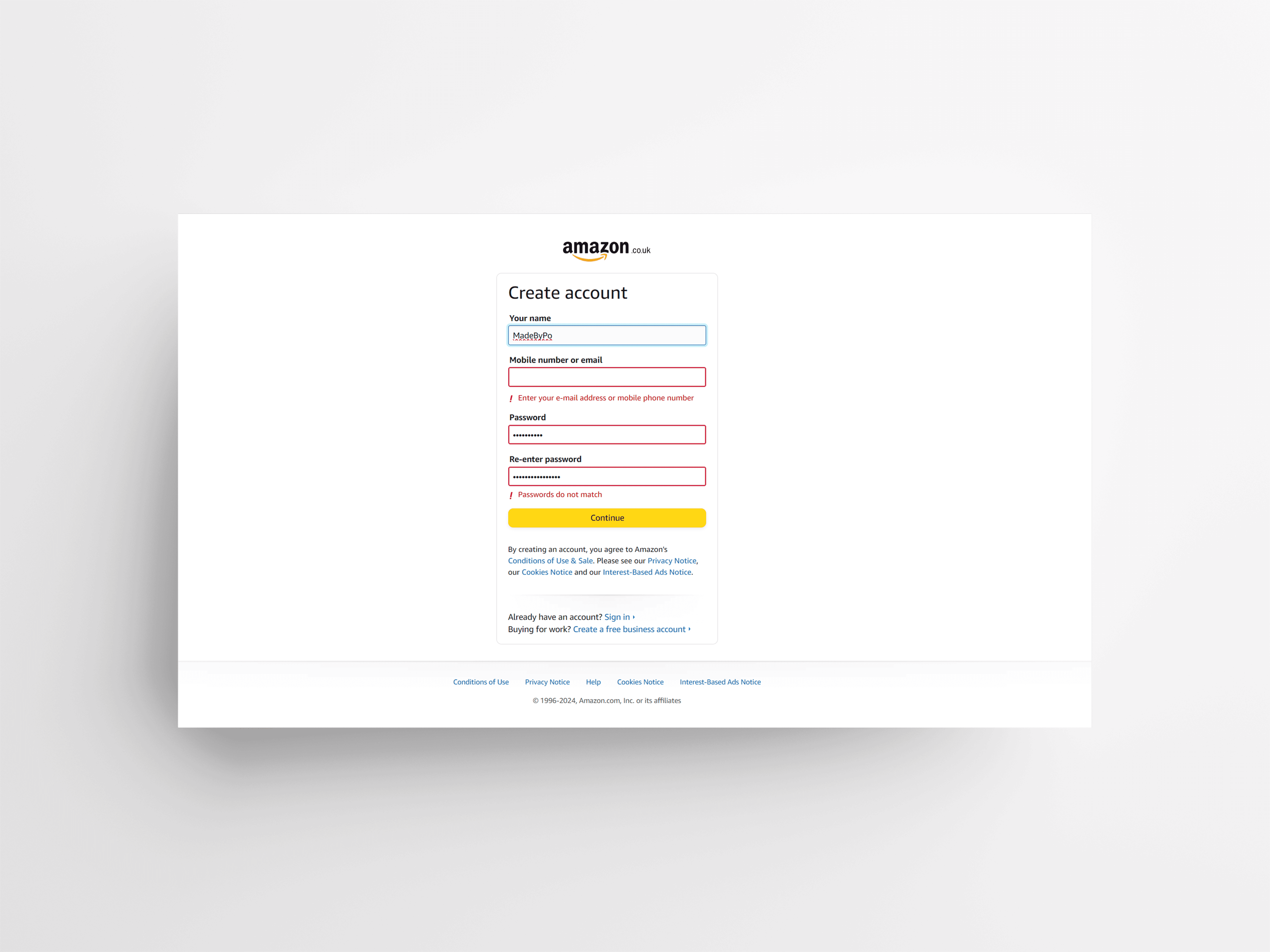
A seemingly straightforward component revealed itself to have numerous parameters that significantly impacted the overall user experience. When I was navigating these complexities, I documented key insights and design decisions, aiming to deliver an exceptional experience even in challenging scenarios. - While explicitly stating password requirements offers clarity, it can also require more effort to process. With limited screen real estate in mind, I opted for an implicit approach, providing a simple interface and offering customers greater flexibility. - This revised initial state is notably less assertive and communicates to the customer more clearly the need to meet the specified requirements. Additionally, research indicated that the password's length was more significant than the listed requirements. - To accommodate all information within the fields, I consolidated various requirements and utilised a horizontal layout to minimise the overall height of the password requirements. - When addressing error states in the design, I faced a decision between extending the form height to accommodate error state captions or simply indicating the change with a colour shift. Following interaction testing, I concluded that extending the form would enhance accessibility, as the animation of captions and form height extension would clearly signal a change in state.
05.
Email Verification
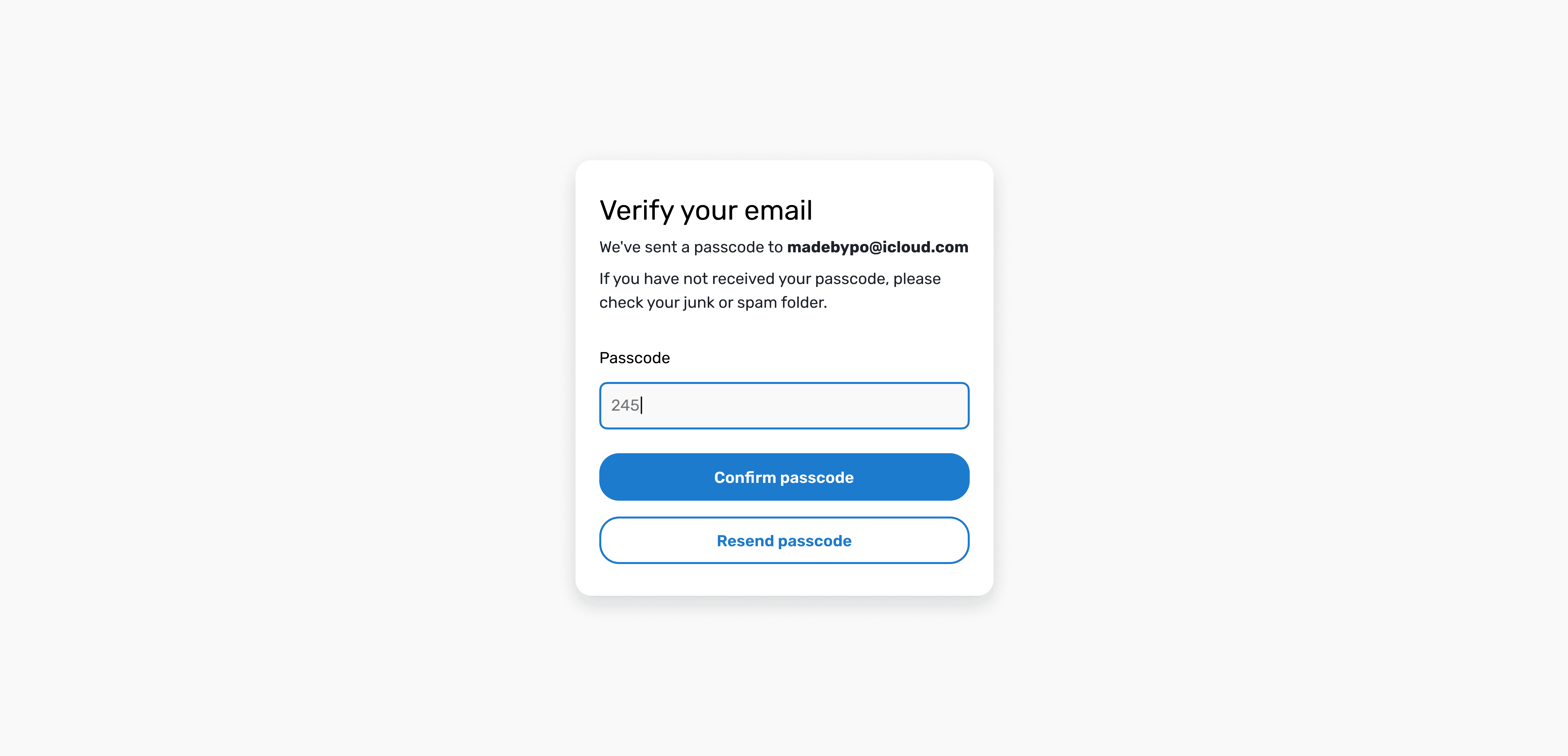
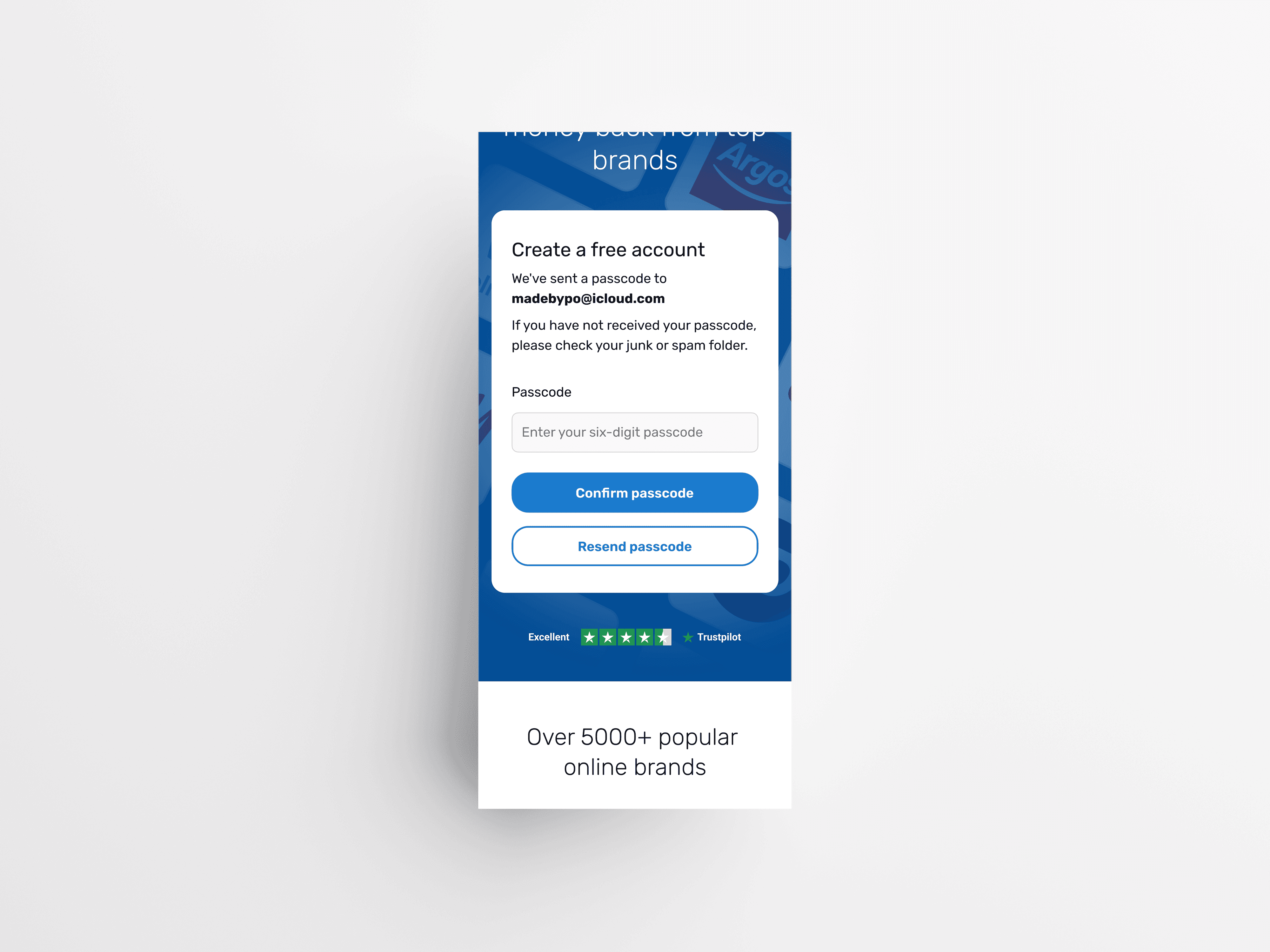
During user testing, a recurring theme emerged: almost all participants expressed concerns about the ease of creating an account. They felt the need to validate their email addresses after registration, as it was a common industry practice. We opted to implement email verification as an additional security measure, prompted by the discovery of numerous fake email addresses in the database, which posed a risk of unauthorized access and fraudulent accounts.
Outcome
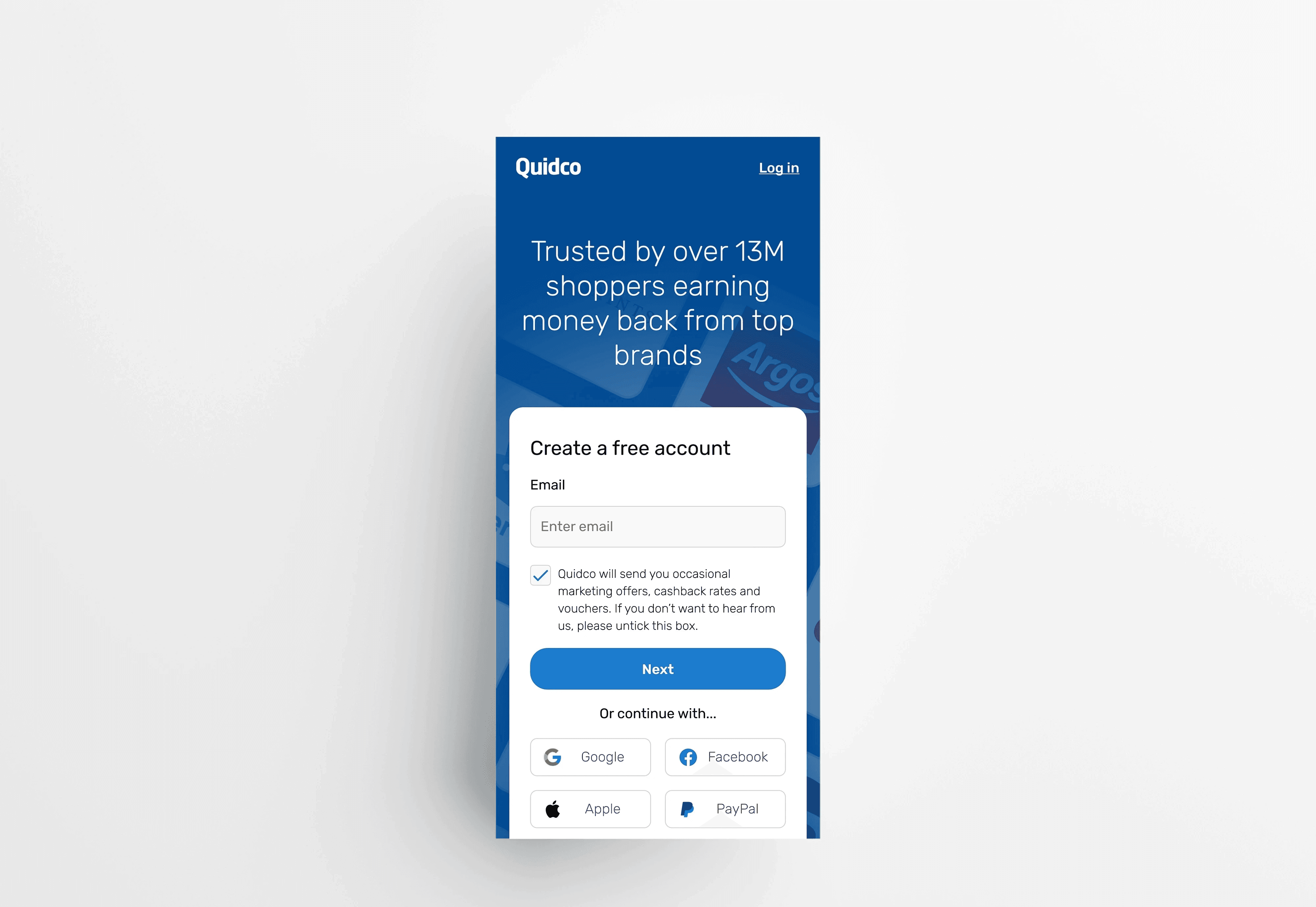
Implementing a user-centric approach, I tackled various customer pain points in this project. It's been a privilege to contribute to improving the registration process and creating a seamless user interface that many customers will appreciate.
As part of the developer hand off, I designed a range of individual components and variants, along with guidelines and documentation to ensure designs were thoroughly executed. These designs are currently under development.
Final designs
DESIGN


Frictionless Entry
Technical details
Client
Quidco
Team
1 Product Designer, 1 Product Owner, 1 SecOps, 2 Developers
Duration
4 Weeks
Year
2023
Category
Web
Skills
Data Analysis
Wireframing
User Interface
Interaction Design
Competitor Analysis
Design System
Tools
Figma
Miro
Jira
Project overview
During the Contentful migration, we viewed it as an opportunity to overhaul our homepage and apply insights gained from the 'Improve Shop Conversion' project to address user pain points. One of the problems was the current sign-up and sign-in process for Quidco users:
Users keep manually entering their email and password - time consuming.
Auto-fill for passwords often leads to users needing to request new passwords.
Accounts being locked out due to multiple failed password attempts.
Risk of multiple accounts being created due to the absence of account verification mechanisms.
In this project, my role was to revamp the homepage to incorporate the latest brand changes. I also had to redesign the form fields to enhance accessibility, improve visual hierarchy, and implement user-friendly interactions. I approached this project with a holistic perspective, aiming to deliver an exceptional user experience with a strong focus on user-centric design principles.
The steps I took
Summary
01.
Research
Used existing research and insights to inform my design decisions.
02.
Competitor Analysis
To identify current trends and best practices in the industry.
03.
Ideation
Encourages creativity, explores innovation, and facilitates problem-solving.
04.
Form Field Insights
A seemingly simple component that turned out to have many parameters.
05.
Email Verification
Add extra layer of security due to number of fake email addresses in the database.
06.
Outcome
Outcome of this project, identify lessons learned, and areas for improvement.
Insights gathering and exploration
Discovery
01.
Research
Utilising existing research and insights not only saved considerable time and resources by eliminating the need for redundant studies or data gathering, but it also streamlined my design decision-making process. With an in-depth understanding of user needs, recurring behavioral patterns, and pain points, my design requirements were clear. A recurring theme became evident during the study: nearly all participants expressed confusion when they initially attempted to sign-in directly from the homepage. After a few attempts, they eventually realised that the 'sign-in' form was intended for creating an account.
02.
Competitor Analysis
Through competitor analysis, I identified common trends and observed how users engage with our competitors. This deep dive provided valuable insights into feature preferences and effective design interactions, such as inline validation, that would enhance the user experience.
Brainstorming, wireframes and designs
Design
03.
Ideation
By utilising all of the previous insights and data, I was able to sketch and explore various ideas, prioritising solutions that addressed user pain points while considering their emotional experience.
04.
Form Field Insights
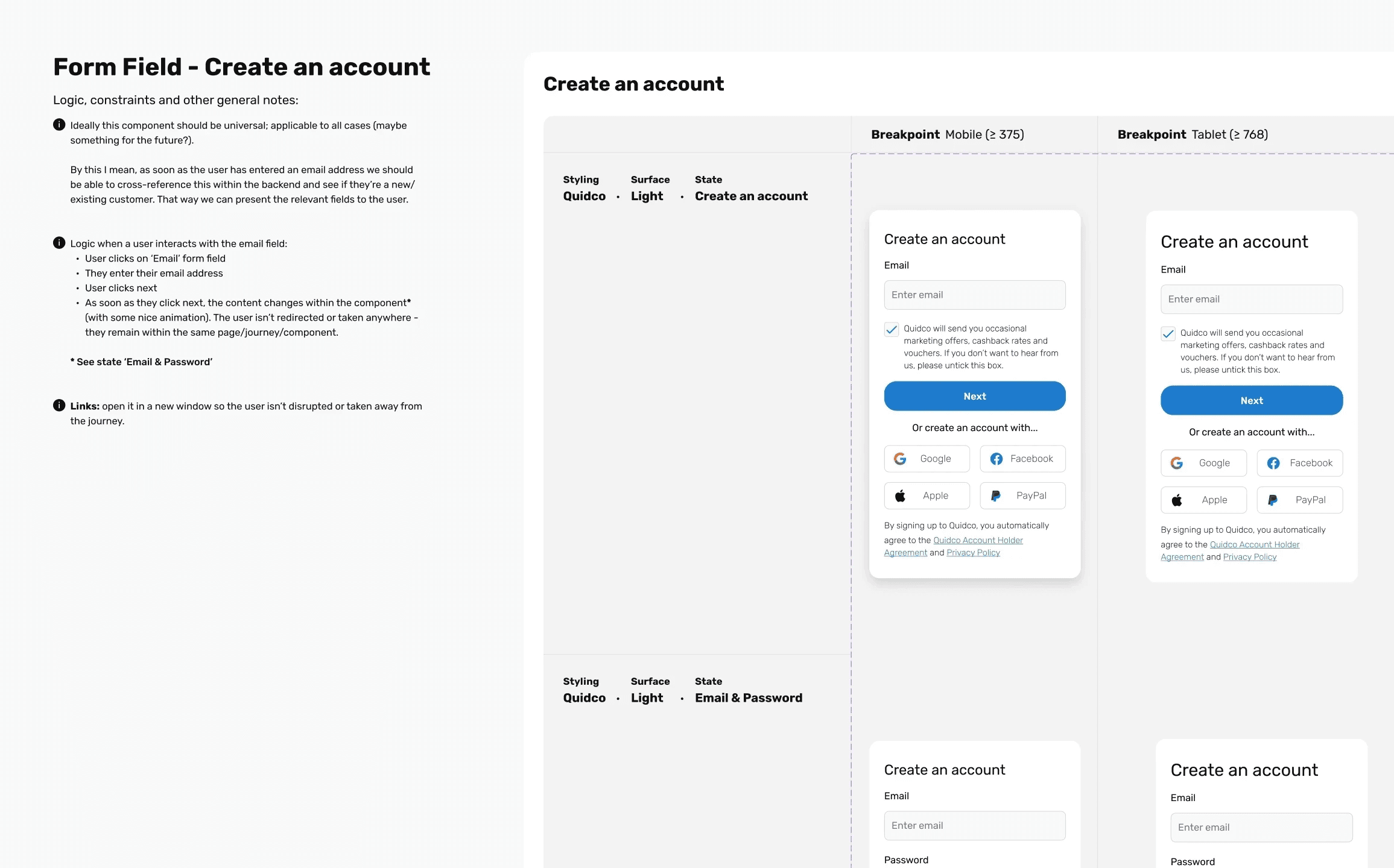
A seemingly straightforward component revealed itself to have numerous parameters that significantly impacted the overall user experience. When I was navigating these complexities, I documented key insights and design decisions, aiming to deliver an exceptional experience even in challenging scenarios. - While explicitly stating password requirements offers clarity, it can also require more effort to process. With limited screen real estate in mind, I opted for an implicit approach, providing a simple interface and offering customers greater flexibility. - This revised initial state is notably less assertive and communicates to the customer more clearly the need to meet the specified requirements. Additionally, research indicated that the password's length was more significant than the listed requirements. - To accommodate all information within the fields, I consolidated various requirements and utilised a horizontal layout to minimise the overall height of the password requirements. - When addressing error states in the design, I faced a decision between extending the form height to accommodate error state captions or simply indicating the change with a colour shift. Following interaction testing, I concluded that extending the form would enhance accessibility, as the animation of captions and form height extension would clearly signal a change in state.
05.
Email Verification
During user testing, a recurring theme emerged: almost all participants expressed concerns about the ease of creating an account. They felt the need to validate their email addresses after registration, as it was a common industry practice. We opted to implement email verification as an additional security measure, prompted by the discovery of numerous fake email addresses in the database, which posed a risk of unauthorized access and fraudulent accounts.
Outcome
Implementing a user-centric approach, I tackled various customer pain points in this project. It's been a privilege to contribute to improving the registration process and creating a seamless user interface that many customers will appreciate.
As part of the developer hand off, I designed a range of individual components and variants, along with guidelines and documentation to ensure designs were thoroughly executed. These designs are currently under development.
Final designs
DESIGN
Frictionless Entry
Technical details
Client
Quidco
Team
1 Product Designer, 1 Product Owner, 1 SecOps, 2 Developers
Duration
4 Weeks
Year
2023
Category
Web
Skills
Data Analysis
Wireframing
User Interface
Interaction Design
Competitor Analysis
Design System
Tools
Figma
Miro
Jira
Project overview
During the Contentful migration, we viewed it as an opportunity to overhaul our homepage and apply insights gained from the 'Improve Shop Conversion' project to address user pain points. One of the problems was the current sign-up and sign-in process for Quidco users:
Users keep manually entering their email and password - time consuming.
Auto-fill for passwords often leads to users needing to request new passwords.
Accounts being locked out due to multiple failed password attempts.
Risk of multiple accounts being created due to the absence of account verification mechanisms.
In this project, my role was to revamp the homepage to incorporate the latest brand changes. I also had to redesign the form fields to enhance accessibility, improve visual hierarchy, and implement user-friendly interactions. I approached this project with a holistic perspective, aiming to deliver an exceptional user experience with a strong focus on user-centric design principles.
The steps I took
Summary
01.
Research
Used existing research and insights to inform my design decisions.
02.
Competitor Analysis
To identify current trends and best practices in the industry.
03.
Ideation
Encourages creativity, explores innovation, and facilitates problem-solving.
04.
Form Field Insights
A seemingly simple component that turned out to have many parameters.
05.
Email Verification
Add extra layer of security due to number of fake email addresses in the database.
06.
Outcome
Outcome of this project, identify lessons learned, and areas for improvement.
Insights gathering and exploration
Discovery
01.
Research
Utilising existing research and insights not only saved considerable time and resources by eliminating the need for redundant studies or data gathering, but it also streamlined my design decision-making process. With an in-depth understanding of user needs, recurring behavioral patterns, and pain points, my design requirements were clear. A recurring theme became evident during the study: nearly all participants expressed confusion when they initially attempted to sign-in directly from the homepage. After a few attempts, they eventually realised that the 'sign-in' form was intended for creating an account.
02.
Competitor Analysis
Through competitor analysis, I identified common trends and observed how users engage with our competitors. This deep dive provided valuable insights into feature preferences and effective design interactions, such as inline validation, that would enhance the user experience.
Brainstorming, wireframes and designs
Design
03.
Ideation
By utilising all of the previous insights and data, I was able to sketch and explore various ideas, prioritising solutions that addressed user pain points while considering their emotional experience.
04.
Form Field Insights
A seemingly straightforward component revealed itself to have numerous parameters that significantly impacted the overall user experience. When I was navigating these complexities, I documented key insights and design decisions, aiming to deliver an exceptional experience even in challenging scenarios. - While explicitly stating password requirements offers clarity, it can also require more effort to process. With limited screen real estate in mind, I opted for an implicit approach, providing a simple interface and offering customers greater flexibility. - This revised initial state is notably less assertive and communicates to the customer more clearly the need to meet the specified requirements. Additionally, research indicated that the password's length was more significant than the listed requirements. - To accommodate all information within the fields, I consolidated various requirements and utilised a horizontal layout to minimise the overall height of the password requirements. - When addressing error states in the design, I faced a decision between extending the form height to accommodate error state captions or simply indicating the change with a colour shift. Following interaction testing, I concluded that extending the form would enhance accessibility, as the animation of captions and form height extension would clearly signal a change in state.
05.
Email Verification
During user testing, a recurring theme emerged: almost all participants expressed concerns about the ease of creating an account. They felt the need to validate their email addresses after registration, as it was a common industry practice. We opted to implement email verification as an additional security measure, prompted by the discovery of numerous fake email addresses in the database, which posed a risk of unauthorized access and fraudulent accounts.
Outcome
Implementing a user-centric approach, I tackled various customer pain points in this project. It's been a privilege to contribute to improving the registration process and creating a seamless user interface that many customers will appreciate.
As part of the developer hand off, I designed a range of individual components and variants, along with guidelines and documentation to ensure designs were thoroughly executed. These designs are currently under development.
Final designs
DESIGN